
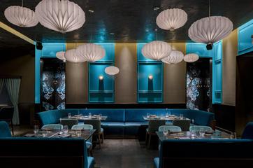
Chic Japanese Steakhouse
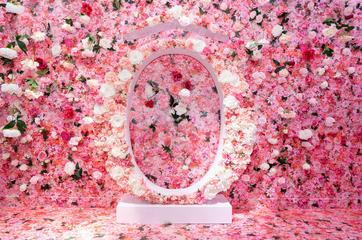
We were mandated to cover more than 3,000 sq. Ft. of walls, floors and ceilings to perfection by impeccably respecting the clean diagonal lines, patterns and lettering found in the various spaces.
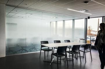
A specific graduated degree of opacity using white ink on transparent film was needed to control the lighting conditions in these headquarters to give an openness to the space as well as privacy within the offices.
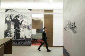
Our challenge for this project was getting these vintage images transformed into bigger than life size murals, without letting any natural imperfections the images had show through.
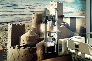
We first developed three giant murals running from the ceiling to the floor which represent a record height of 30 feet. Beside the exceptional size, we had to assure a consistency in the color range so that every panel fit together like a charm.
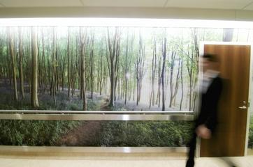
Our goal with this was to transform blank walls to an enchanting landscape of wild hyacinths, symbolizing humility, gratitude and consistency.
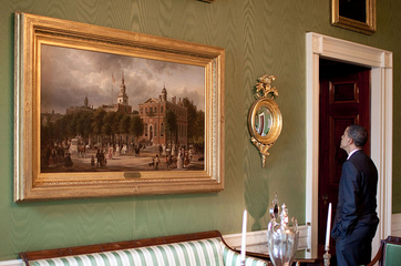
We reproduced 124 original painting from the White House and meticulously applied a glossy varnish on each painting to attain the rigours cracking the original paintings have gained over years and years.
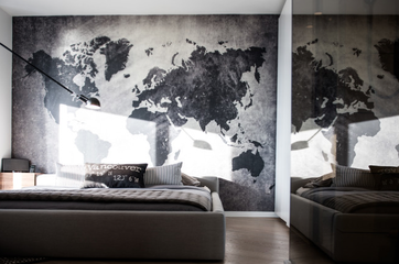
We developed an exclusive pre-pasted wallpaper, using shades that matched an existing fabric swatch.
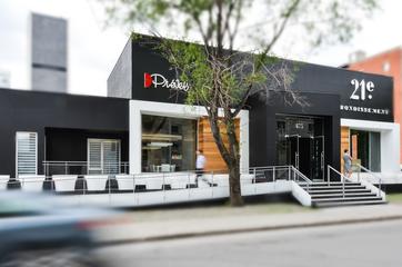
Firstly we created a black wallpaper, which covered the entire ceiling- with a repetition of their logo, we used selective coating for this process.
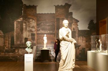
The art of bringing this piece of 300 years BC history to life with murals ...
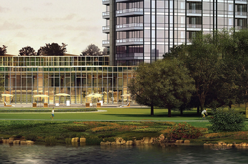
One of the main goals of this project was to design a residential tower respecting eco-friendly principles. In order to meet expectations, we suggested using our LEED-certified pre-pasted wallpaper made entirely from post-consumer fibers.
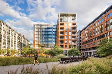
Under the designer's guidance, we developed a custom mural evoking traces of a concrete formwork.
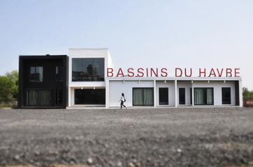
Being able to replace, and update the mural was essential to this project, as plans often grow and change in the process of the evolution in these condos.
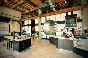
Prolonging the extent of architectural details with a mural
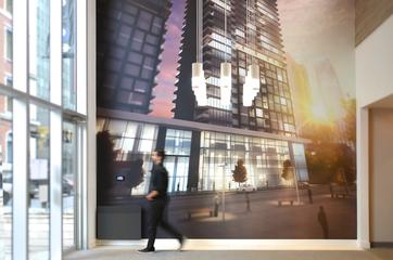
The 30 feet tall mural in the heart of downtown Montreal was worked on so that the final image of the condo was against a beautifully warm summer cityscape.
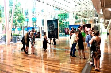
We worked very hard to really recreate a myriad of shades evoking the African heat.
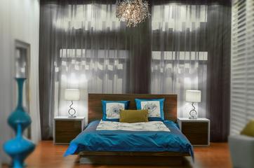
Our main constraint was to turn a place that may seem small and cold into a warm and cozy place.
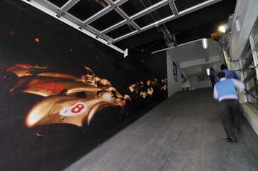
We accepted the challenge and were able to enhance the low-resolution images provided by The MercedesBenz Museum.
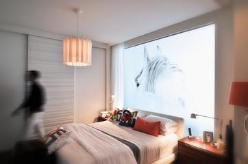
Working by Sonia's side, we chose to replace the mundane pre existing curtains with a translucent frosted film.
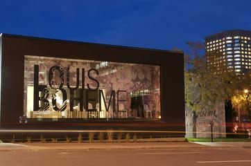
It was imperative for us to apply each panel to ensure consistency within the entirety of this project.
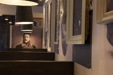
Keeping our eyes on every tiny detail, we carefully calibrated the colors of the images to precisely match the tone of the walls.
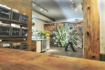
The biggest challenge was highlighting the authenticity and the freshness of the photographs all the while respecting the functional aspect of the storage unit.
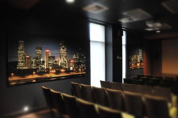
Our challenge was to maximize our panels' efficiency to absorb high-frequencies, which are the main source of unwanted reverberation and echoing issues.
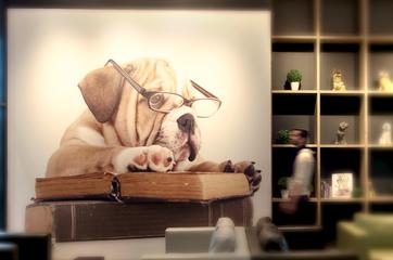
We designed a vinyl mural with a suede finish recreating the lush greenery found in the middle of the best of parks.
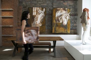
Each canvas is carefully hand polished to highlight the details and textures of the work.